
Across a wide range of industries, the use of data visualisation has exploded over the last decade, with the pace ever increasing.
There has been a shift from analysing data using statistical techniques alone as people adopt graphical representations to aid analysis and understanding.
The growth of business intelligence (BI) tools such as Tableau, Qlik View and Microsoft Power BI that provide advanced analytics and visualisation is a measure of this transformation. These tools leverage the brain’s capacity to quickly understand and interpret graphical rather than numerical representations.
The use of interactive visualisation to present large complex datasets allows the viewer to comprehend and analyse data that would otherwise be impenetrable. You can quickly spot patterns, trends and anomalies that remain hidden or difficult to identify when studied using numerical analytical tools alone
Such tools are increasingly being used within transport planning, alongside the traditional GIS software, such as ArcGIS and MapInfo, for handling geospatial data; and 3D modelling tools to generate photo realistic renderings of transport schemes.
Available BI and GIS software provide powerful functionality to look at static data and simple representations of temporal data, but they lack the capability to easily and effectively combine spatial and temporal elements into interactive visualisations.
What would be the value to transport planning projects if you could easily visualise movement data? What if you could easily analyse and communicate the key metrics in a project? How do trip profiles change over time? How do traffic flow, speed, concentration or pollution levels vary throughout a network over an hour, week, month, year? What could be achieved with improved visualisation?
The use of interactive visualisation to present large complex datasets allows the viewer to comprehend and analyse data that would otherwise be impenetrable. You can quickly spot patterns, trends and anomalies that remain hidden or difficult to identify when studied using numerical analytical tools alone. This is particularly apparent when dealing with movement data that varies by time as well as location; for example, you can easily highlight trips by purpose, origin, destination, mode of transport or any combination.
Interactive visualisations exploit and enhance the viewers’ cognitive capabilities rather than relying on predefined numerical approaches. If both temporal and spatial dimensions can be easily and effectively visualised, visualisation becomes valuable at all stages of a transport project.
With the ongoing shift to using large complex datasets automatically generated from sensors rather than traditional surveys to feed our transport models, it is more important than ever to understand the datasets being used. With the correct tools it becomes fast and easy to visually screen and validate this input data.
As models are developed visualisation is an effective tool for their calibration and validation. Model outputs can be visually compared against count data. While such visual inspection doesn’t replace statistical analysis, it can greatly accelerate the calibration phase by making it easier to spot inconsistencies, making iterations faster and reducing the number required.
Similarly, interactive visualisations of model output reveal insight during the analysis of results. Many leading traffic simulation software packages include visualisation capabilities for this purpose but others lack the functionality as do custom developed spreadsheet, R or Python models.
While these types of visualisations can be created through the use of a combination of existing tools, it can be time consuming, cumbersome and may require the outsourcing of production to another team or outside agency
When communicating the results from studies visualisation becomes vital. Outputs from a range of analyses and models need to be communicated to stakeholders who are not necessarily experts in the use of a particular technique, or are not used to looking at such outputs.
Results need to be shared between sub-teams working on a project such as transport, economic and environmental teams; with project managers; project sponsors; and, in some cases, with ministers and the general public. The ability to convey complex information in a concise understandable way is crucial for a project to progress.
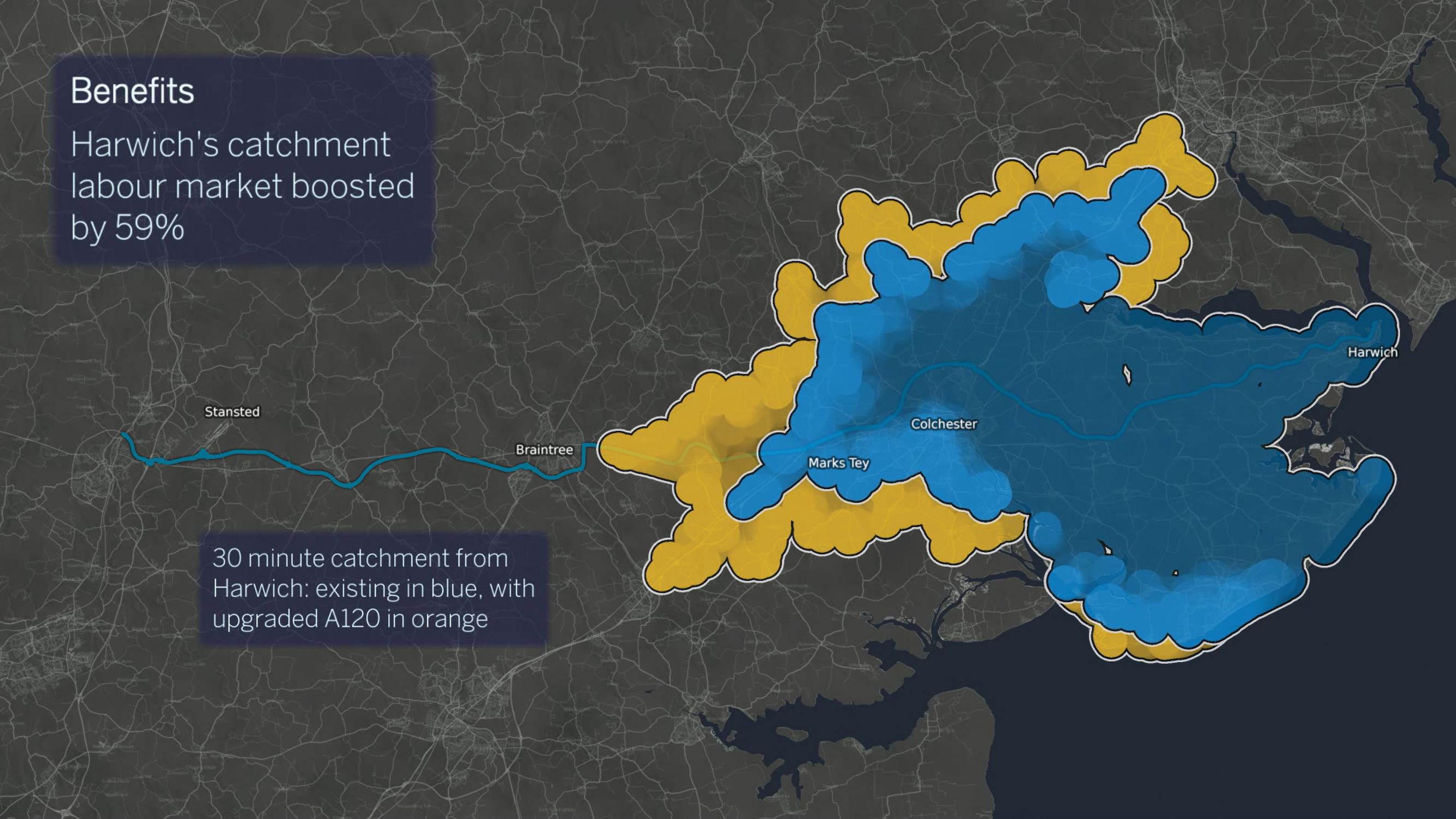
An effective visualisation can summarise a 200-page report into a two-minute video. It can set out the issues, present and quantify benefits in a way that non-experts can understand. A good example of this is the visualisation produced to explain the Haven Gateway project to the public, local and national politicians (See Figure 1).
A key component of a successful visualisation is the ability to present different datasets in a common visual language. Consider the case of a new road scheme where a report may include historical and projected traffic data for a base case and different schemes, accident data, noise and air quality data, journey time predictions, as well as contextual information.
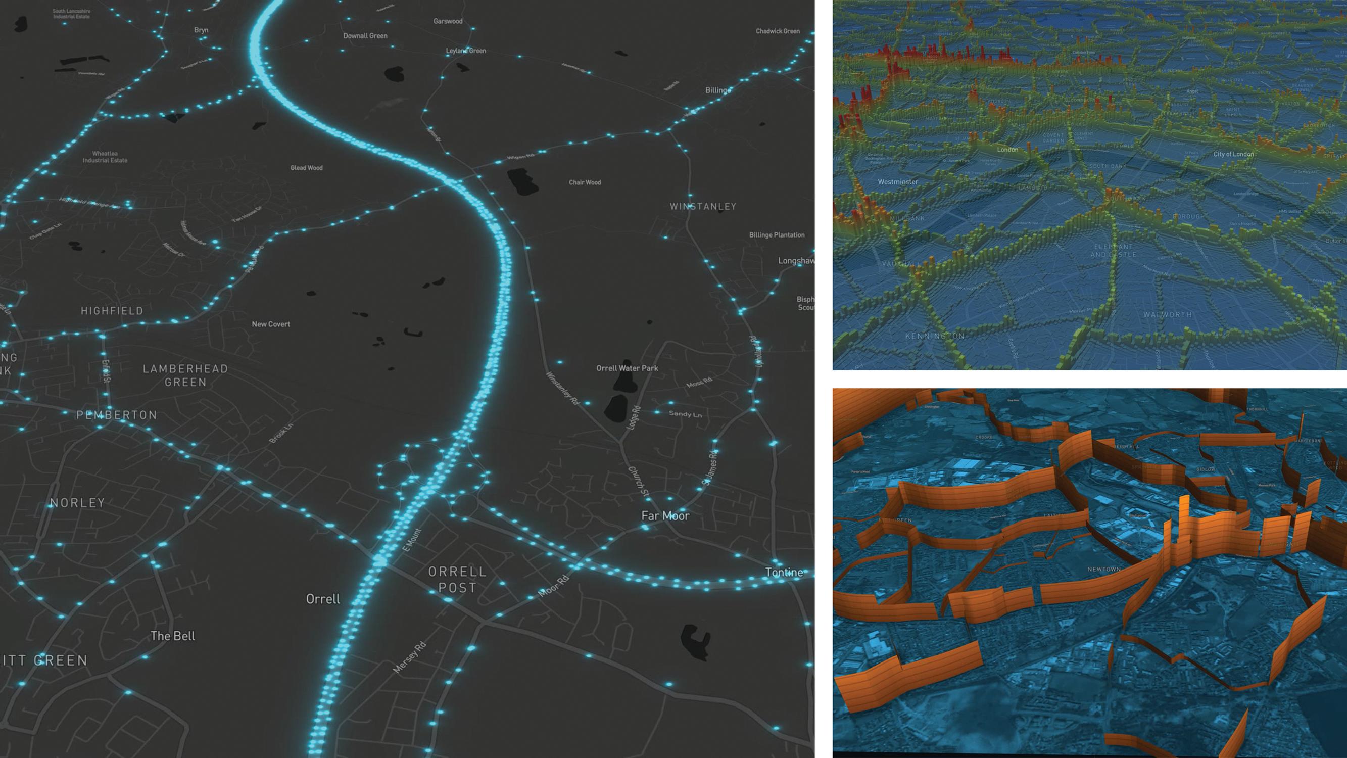
These come from multiple sources, both measured and modelled, and data formats vary. The report is much easier for both the expert and non-expert audience to understand if all of this information is presented in a consistent style rather than varying according to the software package that produced the data (See Figure 2 for different datasets presented in a common visual language).
While these types of visualisations can be created through the use of a combination of existing tools, it can be time consuming, cumbersome and may require the outsourcing of production to another team or outside agency.
For this reason Ito World, a UK-based software company, has been developing a tool, Ito Motion, that specialises in movement data.
Working with a number of partners in the transport and visualisation fields including TfL, TfGM, CASA at UCL, DfT and engineering consultancies, Ito World has focused on producing a visualisation product that understands transport data.
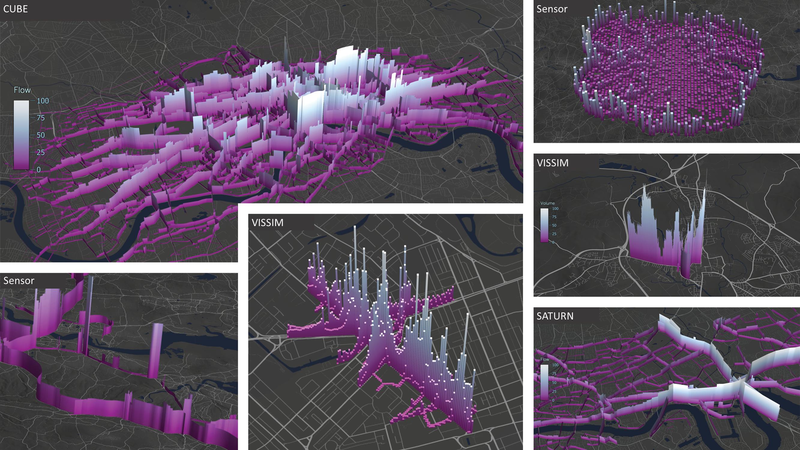
Data is loaded into Ito Motion through a simple drag and drop interface. Then its inbuilt knowledge of files from popular traffic simulation tools as well as support for shapefiles and csv files allow insightful interactive visualisations to be created in seconds.
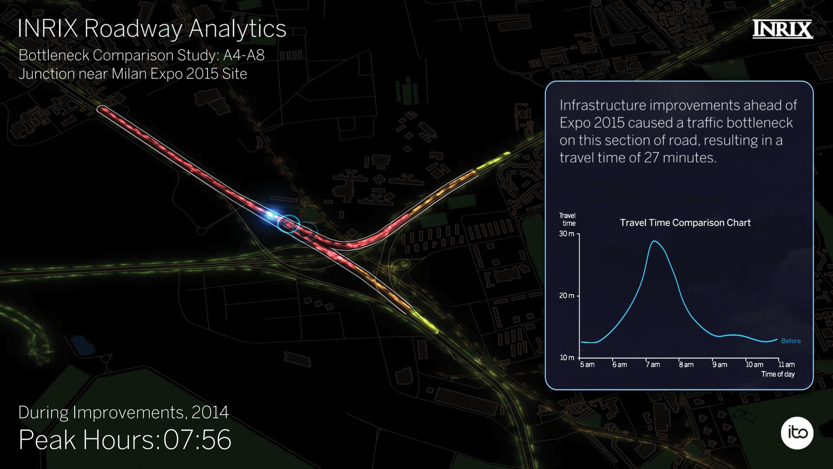
This speed and ease of use combined with a wide range of visualisation styles tailored to movement data makes Ito Motion ideally suited to be used throughout a transport project. A single tool can be used to analyse sensor data, calibrate and validate models, analyse model results and communicate findings to both technical and non-technical audiences. Example outputs can be seen in Figure 3. Ito World has been providing visualisations of complex movement data including mobile phone data, traffic simulations and public transportation as a service for several years (See Figure 4). The technology underpinning these striking data visualisations is now being made available in Ito Motion.Ito World will be presenting at Modelling World this June.
Daren Rapley is Head of Business Development at Ito World
TransportXtra is part of Landor LINKS
![]()
© 2026 TransportXtra | Landor LINKS Ltd | All Rights Reserved
Subscriptions, Magazines & Online Access Enquires
[Frequently Asked Questions]
Email: subs.ltt@landor.co.uk | Tel: +44 (0) 20 7091 7959
Shop & Accounts Enquires
Email: accounts@landor.co.uk | Tel: +44 (0) 20 7091 7855
Advertising Sales & Recruitment Enquires
Email: daniel@landor.co.uk | Tel: +44 (0) 20 7091 7861
Events & Conference Enquires
Email: conferences@landor.co.uk | Tel: +44 (0) 20 7091 7865
Press Releases & Editorial Enquires
Email: info@transportxtra.com | Tel: +44 (0) 20 7091 7875
Privacy Policy | Terms and Conditions | Advertise
Web design london by Brainiac Media 2020